CASE STUDY
TORONTO INC BOOTHS
Digital Art & Illustration I Environmental Design I Booth Design
Destination Toronto
Destination Toronto
Project Overview
The Toronto Inc Booths project was a collaborative effort involving Destination Toronto, the City of Toronto, Toronto Global, and the Toronto Regional Board of Trade. The goal was to synchronize messaging under the Toronto Narrative, creating a visual identity that represented Toronto’s dynamic spirit and cultural diversity at major technology events like the Web Summit and Collision.
Challenges
The primary challenge was developing a cohesive visual identity that embodied the essence of the Toronto Narrative without an existing visual framework. This required creating a vibrant colour palette and dynamic artwork that could resonate across diverse audiences while maintaining brand consistency among the partner organizations.
Colour Palette Development
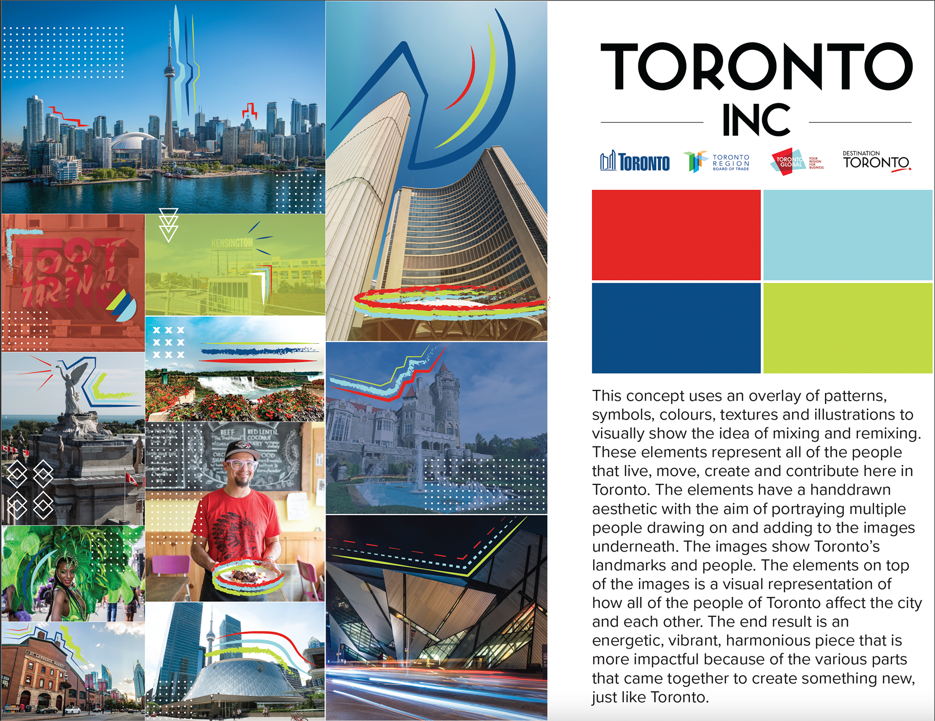
In developing the color palette for the Toronto Inc Booths, I drew inspiration from the partner organizations' logos, ensuring that the palette reflected the identities of all four companies equally. The vibrant colors were selected to embody Toronto's multicultural vibrancy and innovation while standing out in a crowded conference environment. The palette was designed to be flexible and complementary, allowing for seamless integration across different design elements and ensuring a unified and collaborative visual identity that effectively represented each organization.





brainstorm
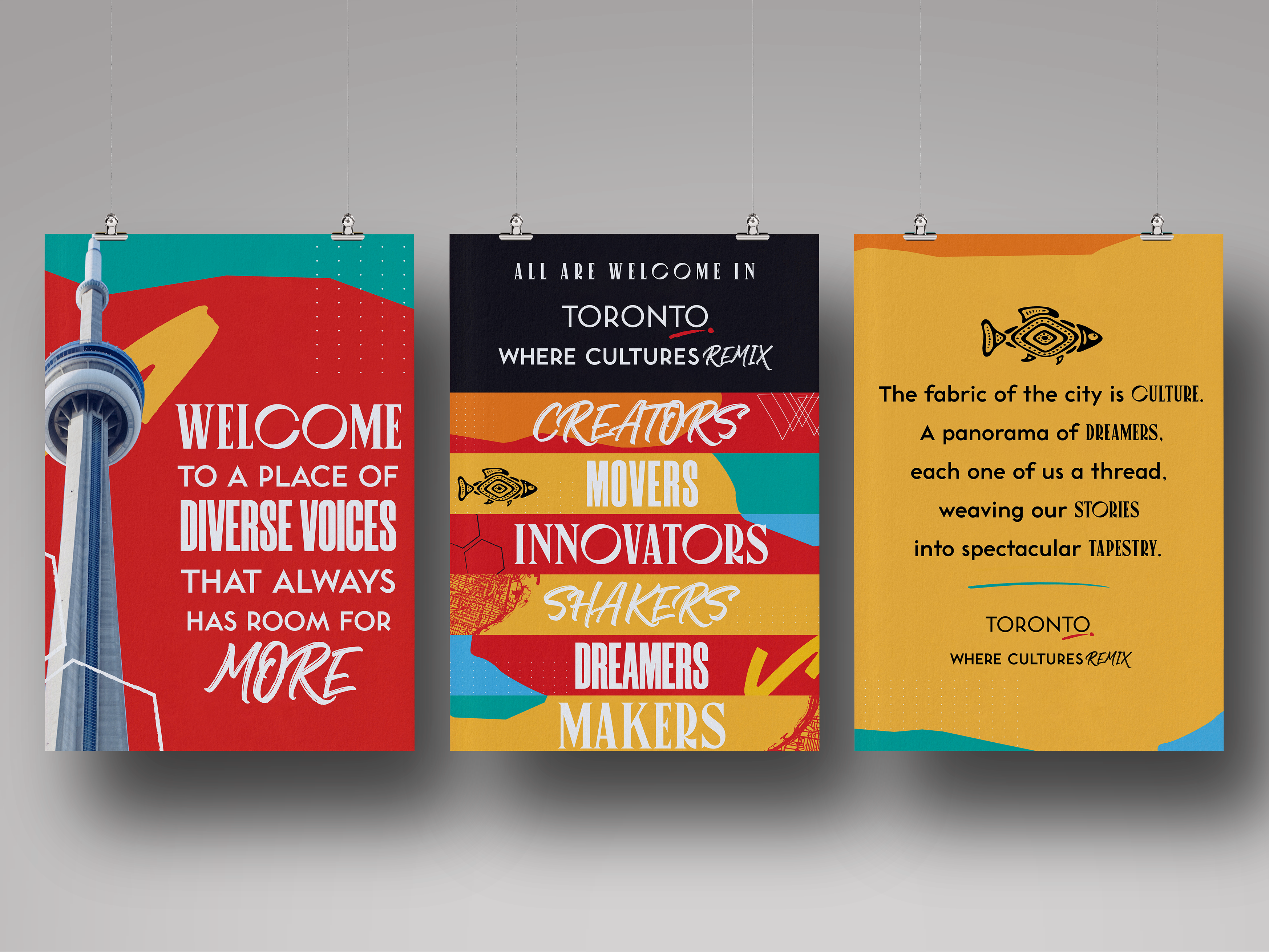
The Toronto Narrative, a collective agreement among all companies in Toronto Inc, served as the foundation for the booth's design. This narrative emphasizes the city's dynamic nature, where people continuously mix and remix to create new versions of Toronto. The challenge was to translate this idea into a visual format. I developed two concepts based on this narrative:
Concept #1: This design uses an overlay of patterns, symbols, colours, textures, and illustrations to visually convey mixing and remixing. These elements, representing Toronto's diverse inhabitants, have a hand-drawn aesthetic, depicting multiple people adding to underlying images of the city’s landmarks and residents. The end result is an energetic and harmonious piece, symbolizing how diverse elements come together to form a vibrant Toronto.
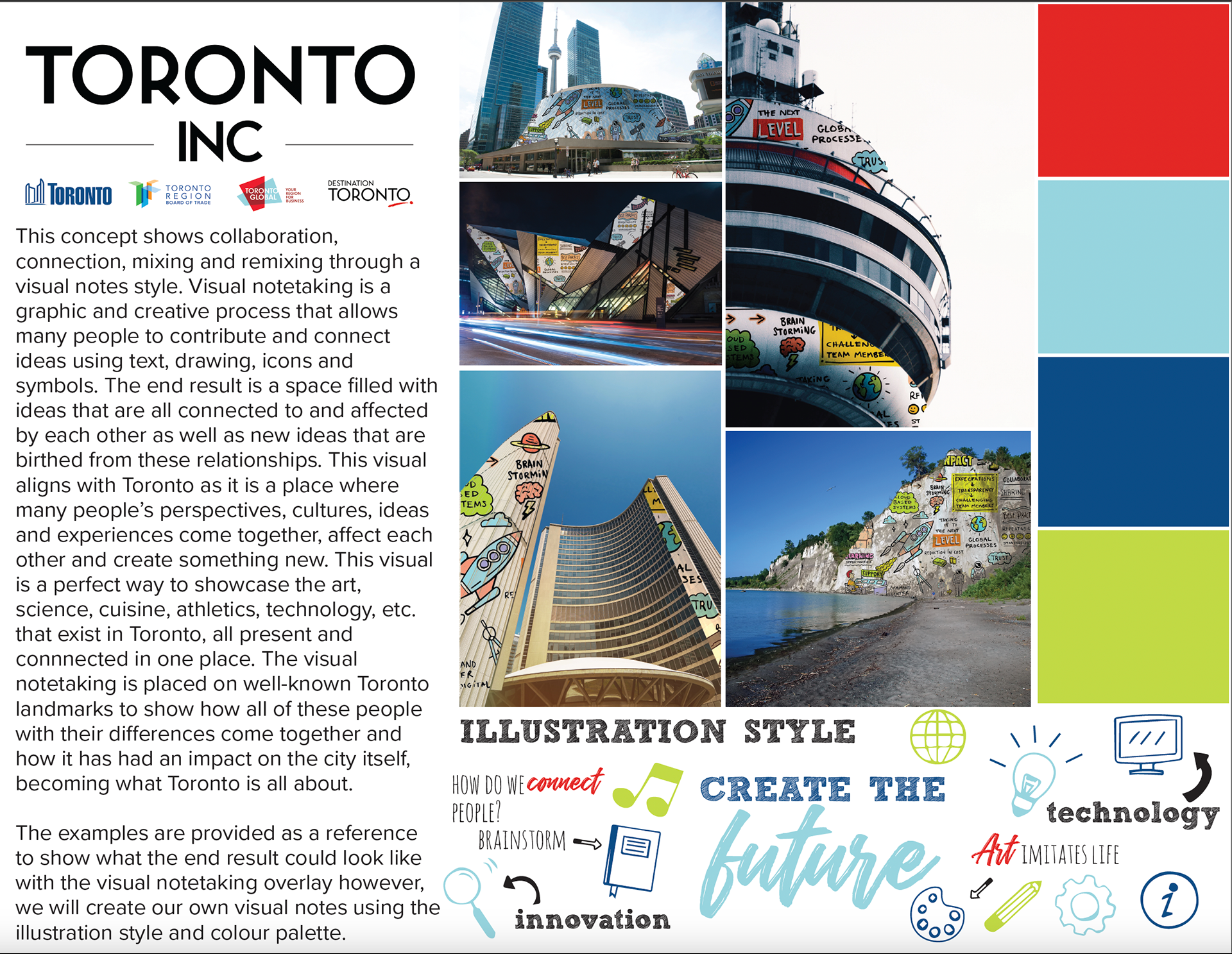
Concept #2: This approach utilizes a visual notes style to depict collaboration, connection, and remixing. Visual notetaking is a graphic process that involves connecting ideas using text, drawings, icons, and symbols. It illustrates Toronto as a hub where perspectives, cultures, and experiences converge and evolve. The visual overlays on Toronto's landmarks demonstrate how diverse influences shape the city, highlighting art, science, cuisine, athletics, and technology as interconnected elements that define Toronto.
Web summit 2022 booth
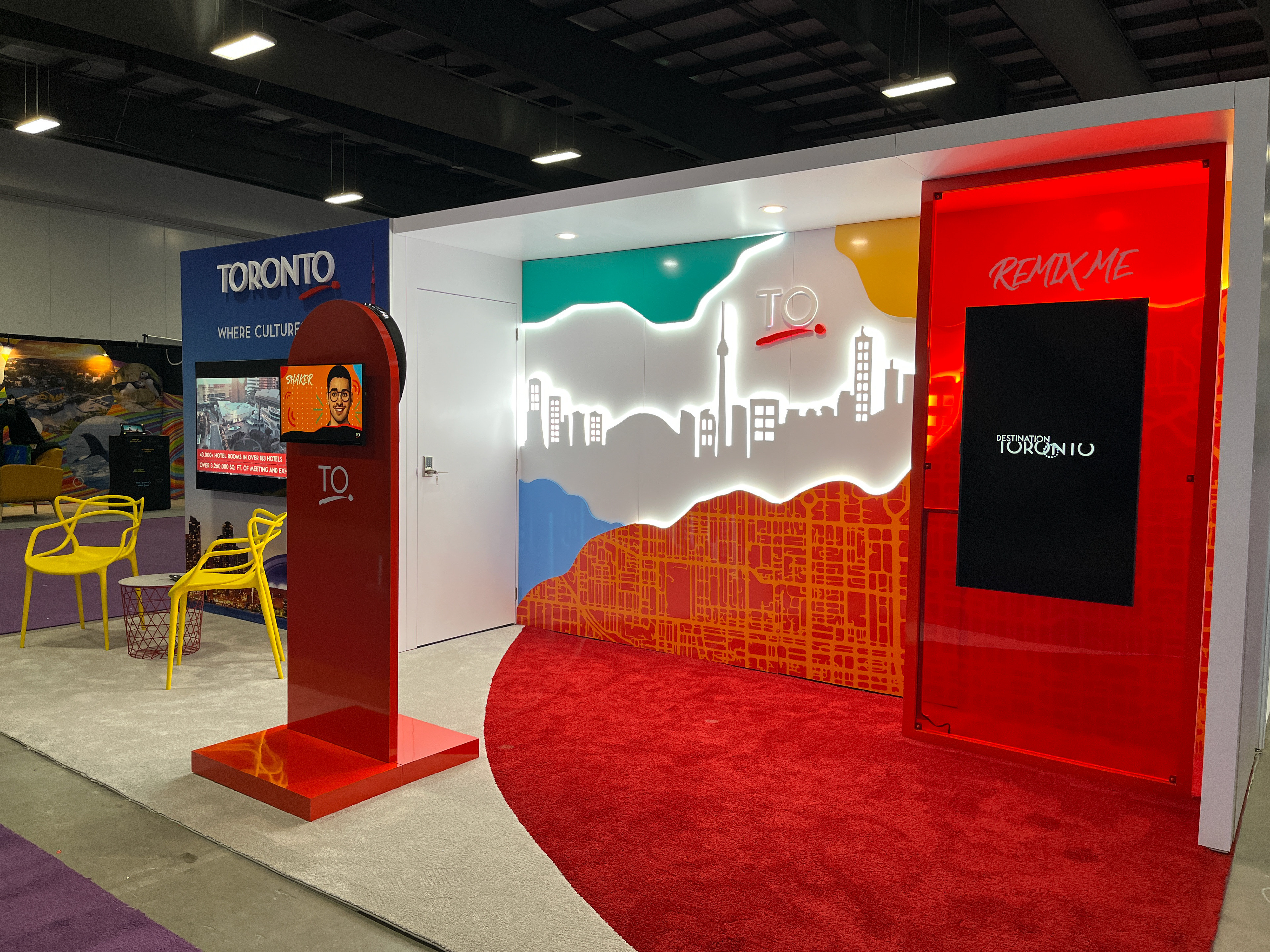
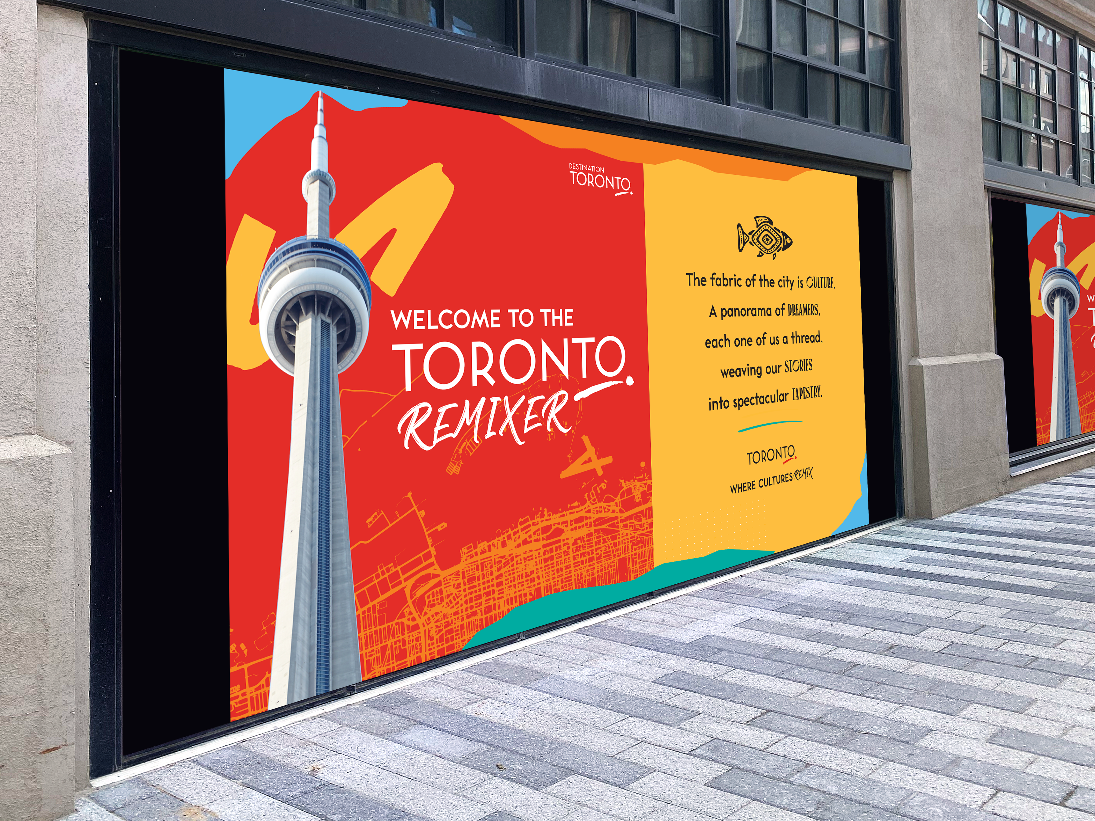
The Web Summit 2022 marked the debut of the Toronto Inc Booth, where Concept 1 was selected by stakeholders for its dynamic representation of the Toronto Narrative. I applied this concept across all booth panels, choosing strong images of Toronto's landmarks and people, overlaid with hand-drawn elements to illustrate the city's vibrant mix. To add a sense of place and break up the collages, I used hero images of iconic Toronto buildings on the front and back walls. Triangles in brand colours and a Toronto map were incorporated for visual interest, complementing the Toronto Inc logo and ensuring the design remained engaging without overwhelming viewers.
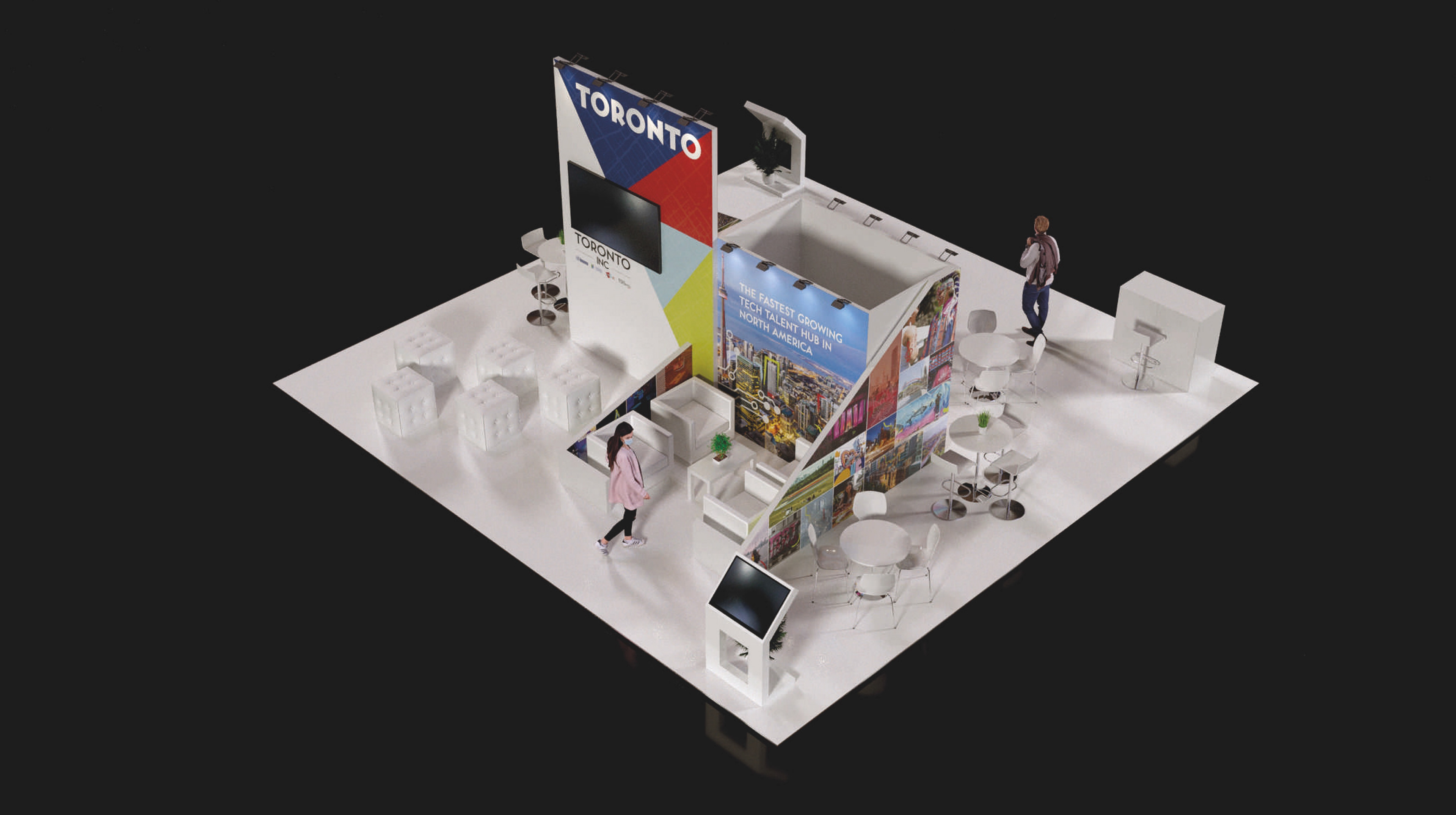

Collision 2023 booth
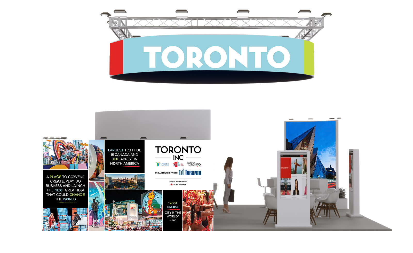
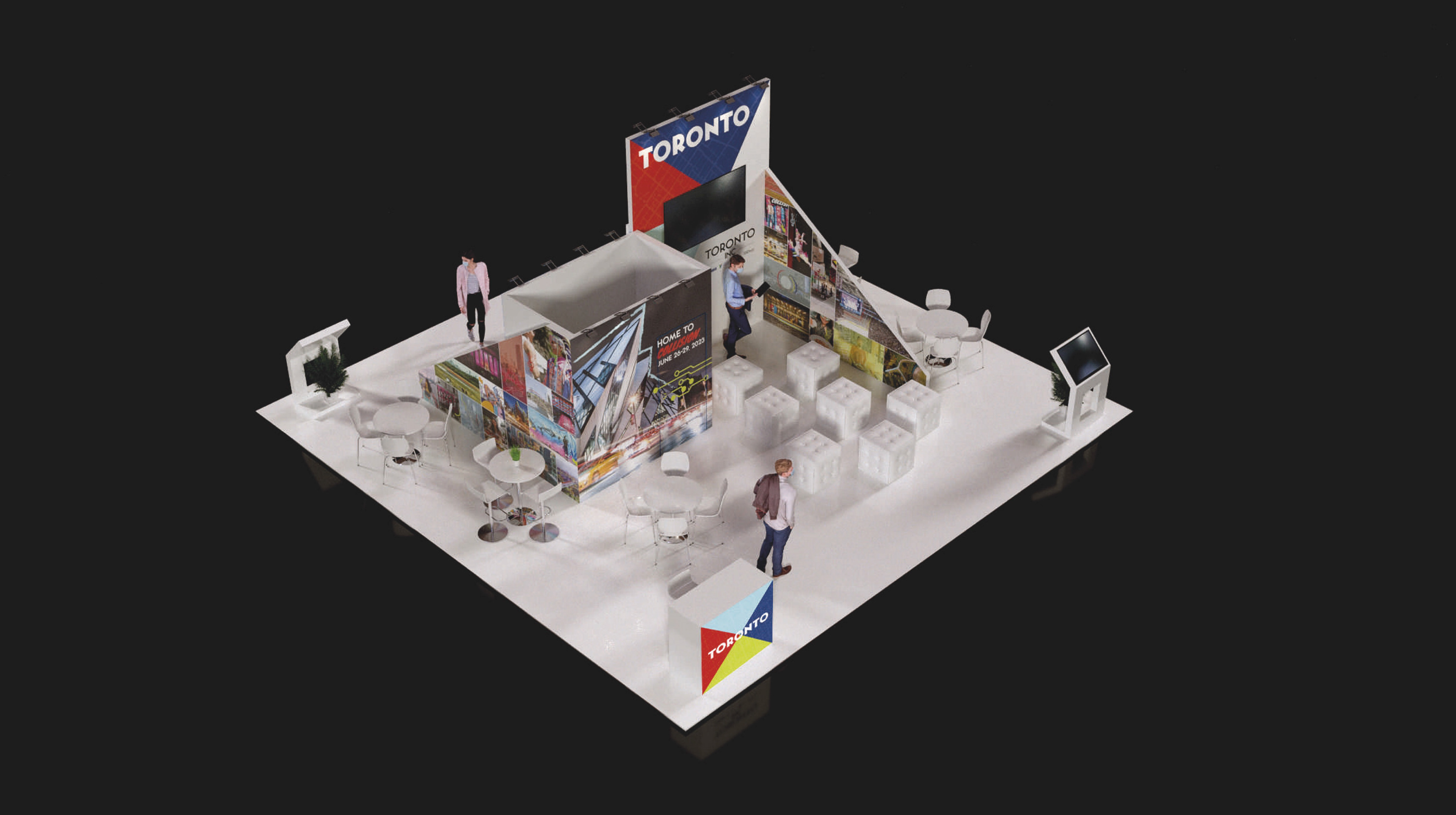
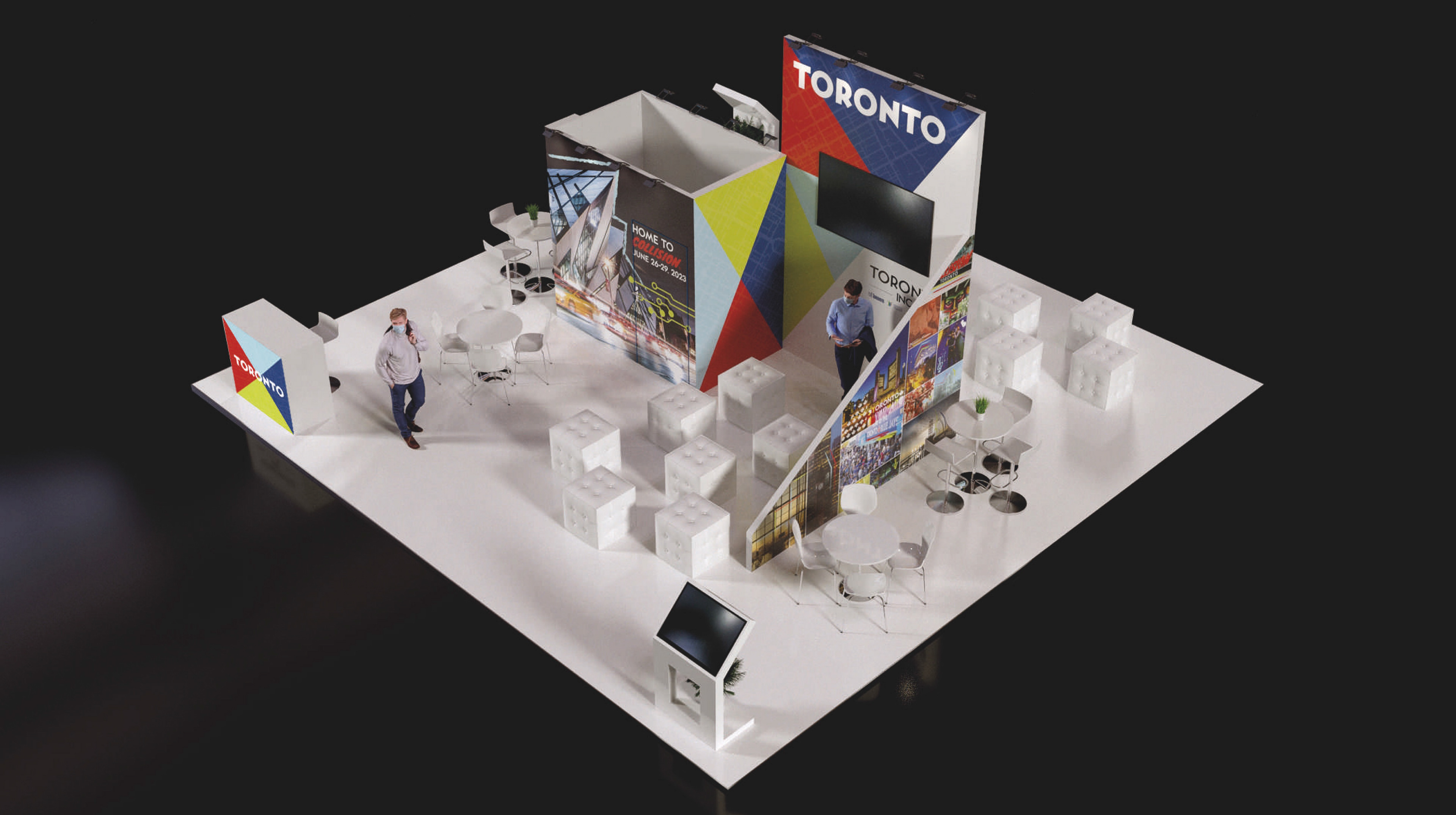
The 2023 booth built on the visual treatment from the previous year’s Toronto Inc Booth at Web Summit and was inspired by the new shared Destination Narrative. This iteration focused on the people of Toronto and the energy they bring, using a collage treatment to represent the city's harmonious diversity and daily innovation.
Toronto accolades and quotes highlighted the achievements and opportunities in the city. Mixed fonts and hand-drawn elements visually communicated the concept of mixing and remixing. Fewer images were used for cleaner collages, drawing more attention to individual images. Different brand colours and mixed text were applied to accolades to emphasize diversity. Hand-drawn elements and patterns were toned down and used strategically, complementing rather than dominating the design. Overall, the design refined the previous year’s concept, achieving a balance between vibrancy and clarity.

Web summit 2023 booth
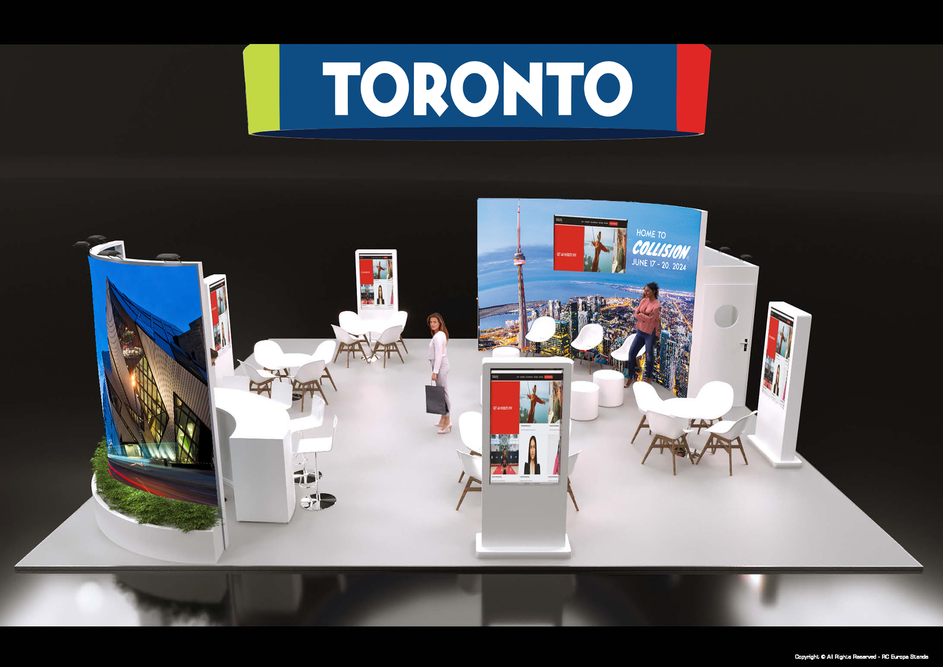
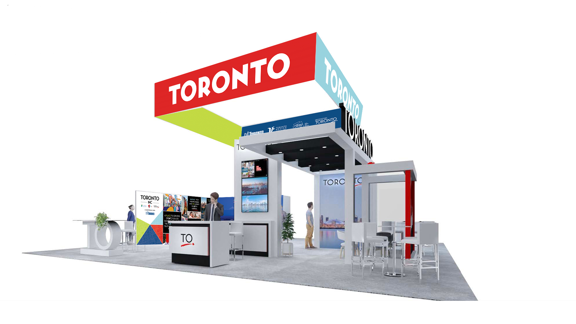
The refined design from previous iterations served as a foundation that could be customized for different booth designs. For Web Summit 2023, I established a standard where hero images, collages with accolades, color blocking, and maps were used and adapted to fit the booth’s circular design. This approach allowed the booth to remain fresh yet recognizable, creating a consistent foundation for future conferences.
Conclusion
The Toronto Inc booth design stood out on conference floors, offering a unique and identifiable presence. Its consistent use of design elements made it easily recognizable, garnering positive feedback for its impactful and cohesive representation of Toronto's dynamic identity.
