CASE STUDY
TORONTO PEARSON AIRPORT DOORS
Digital Art & Illustration I Environmental Design
Destination Toronto
Destination Toronto
Project Overview
Toronto Pearson Airport approached us to create welcoming artwork at the final exit doors—the last gateway before entering Toronto. As the Lead Designer, I was tasked with crafting visually engaging designs that embodied the vibrant energy and diversity of the city. The goal was to create an immediate, memorable impact for both international visitors and returning residents, ensuring their first and last impressions of the city were filled with a sense of Toronto's dynamic spirit.
Challenges
The project presented significant challenges, primarily in designing artwork that could universally appeal to international visitors and returning residents. Another critical challenge was to encapsulate the essence of Toronto—its energy, diversity, and culture—into a single visual representation that felt authentic and inviting. Balancing creativity with clear communication was essential to ensure the artwork resonated with visitors and accurately reflected Toronto's identity.
Brainstorming
The creative process began with an extensive brainstorming phase, where I drew inspiration from various sources to develop a unique and engaging concept for the airport doors. I looked at successful examples from other cities and reviewed our internal campaigns to gather insights. This phase allowed me to understand what had been effective and how those elements could be adapted to capture the essence of Toronto. The brainstorming was crucial in forming the foundation for the designs, using our successful internal campaigns as a springboard to innovate while staying true to the city's character.
The creative process began with an extensive brainstorming phase, where I drew inspiration from various sources to develop a unique and engaging concept for the airport doors. I looked at successful examples from other cities and reviewed our internal campaigns to gather insights. This phase allowed me to understand what had been effective and how those elements could be adapted to capture the essence of Toronto. The brainstorming was crucial in forming the foundation for the designs, using our successful internal campaigns as a springboard to innovate while staying true to the city's character.
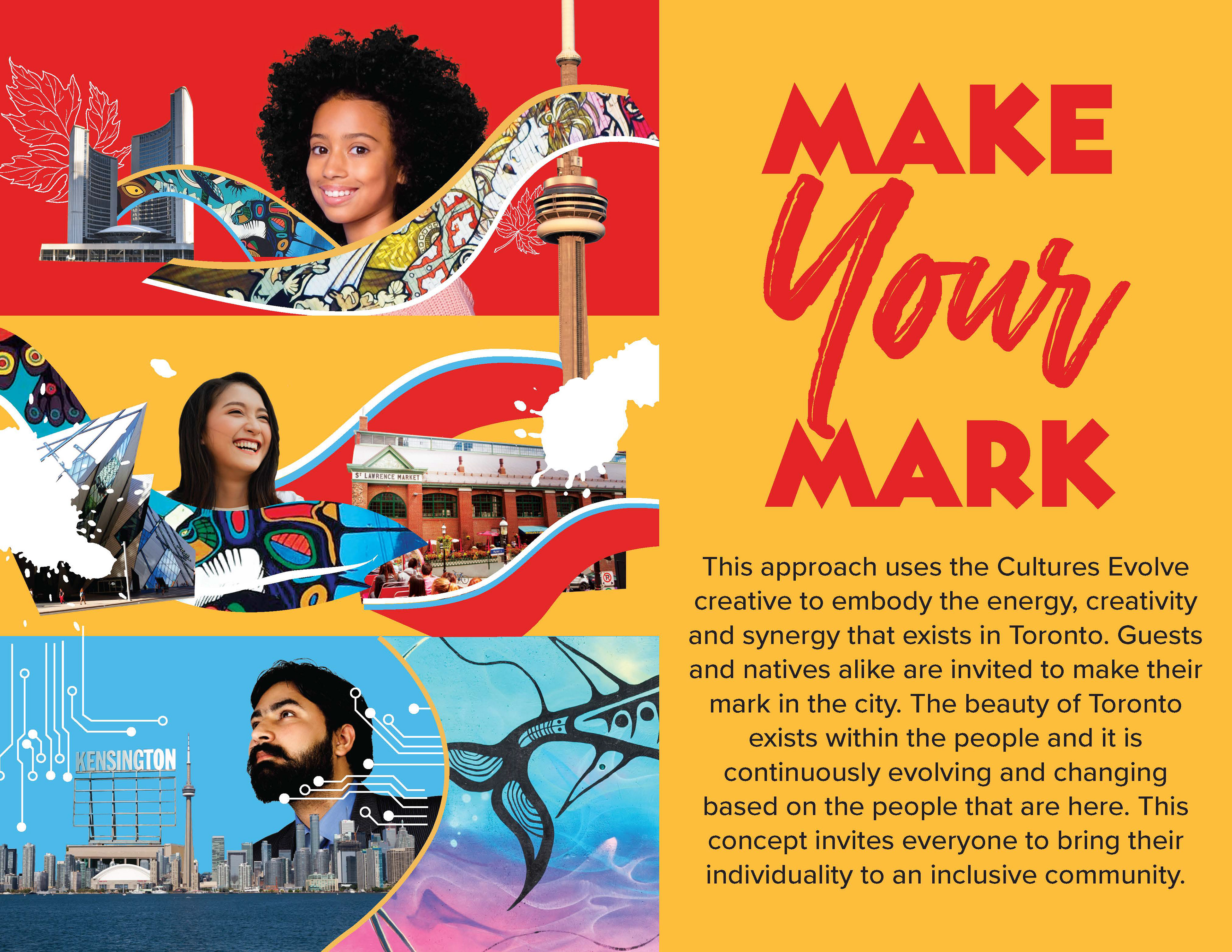
Idea #1 - Make Your Mark
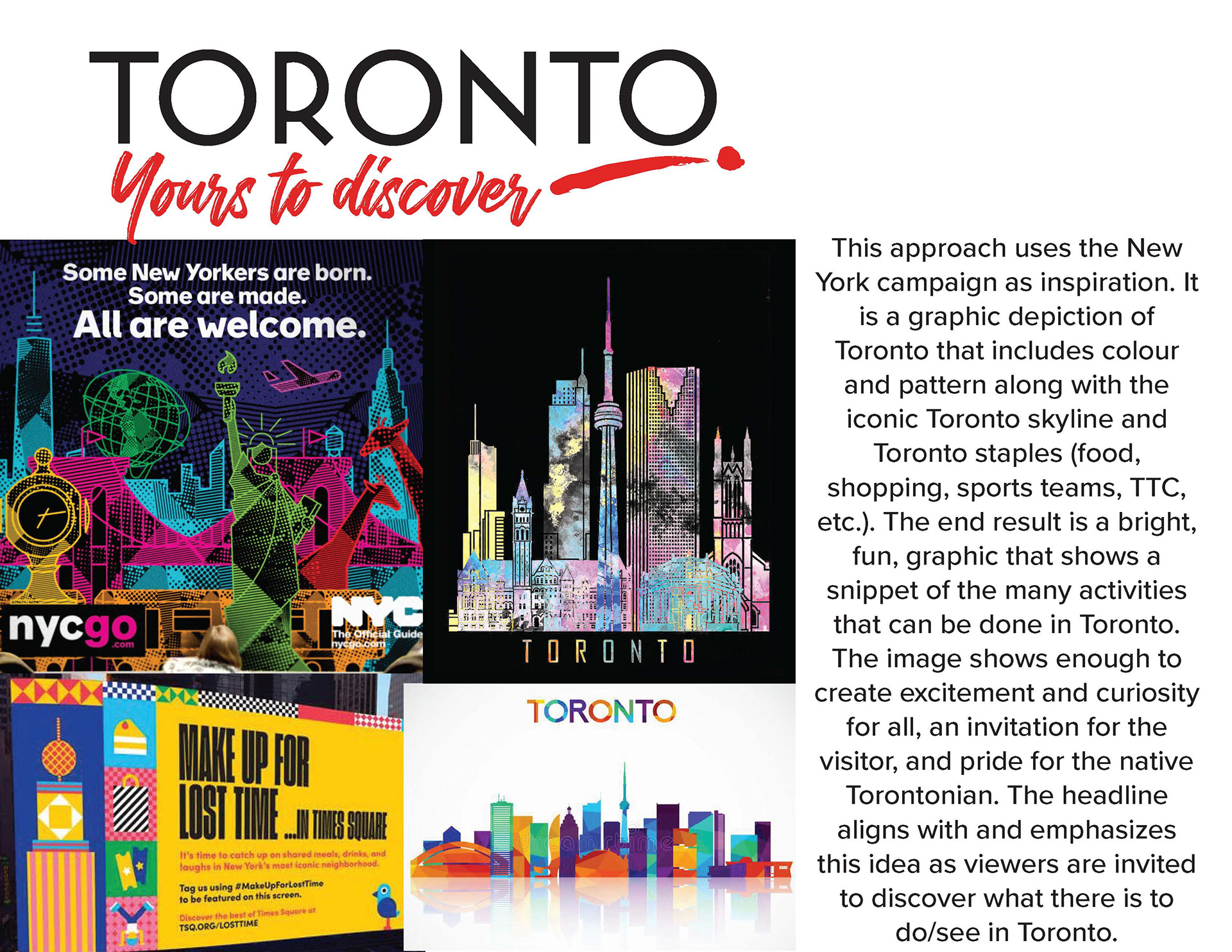
Idea #2 - Toronto, Yours to Discover
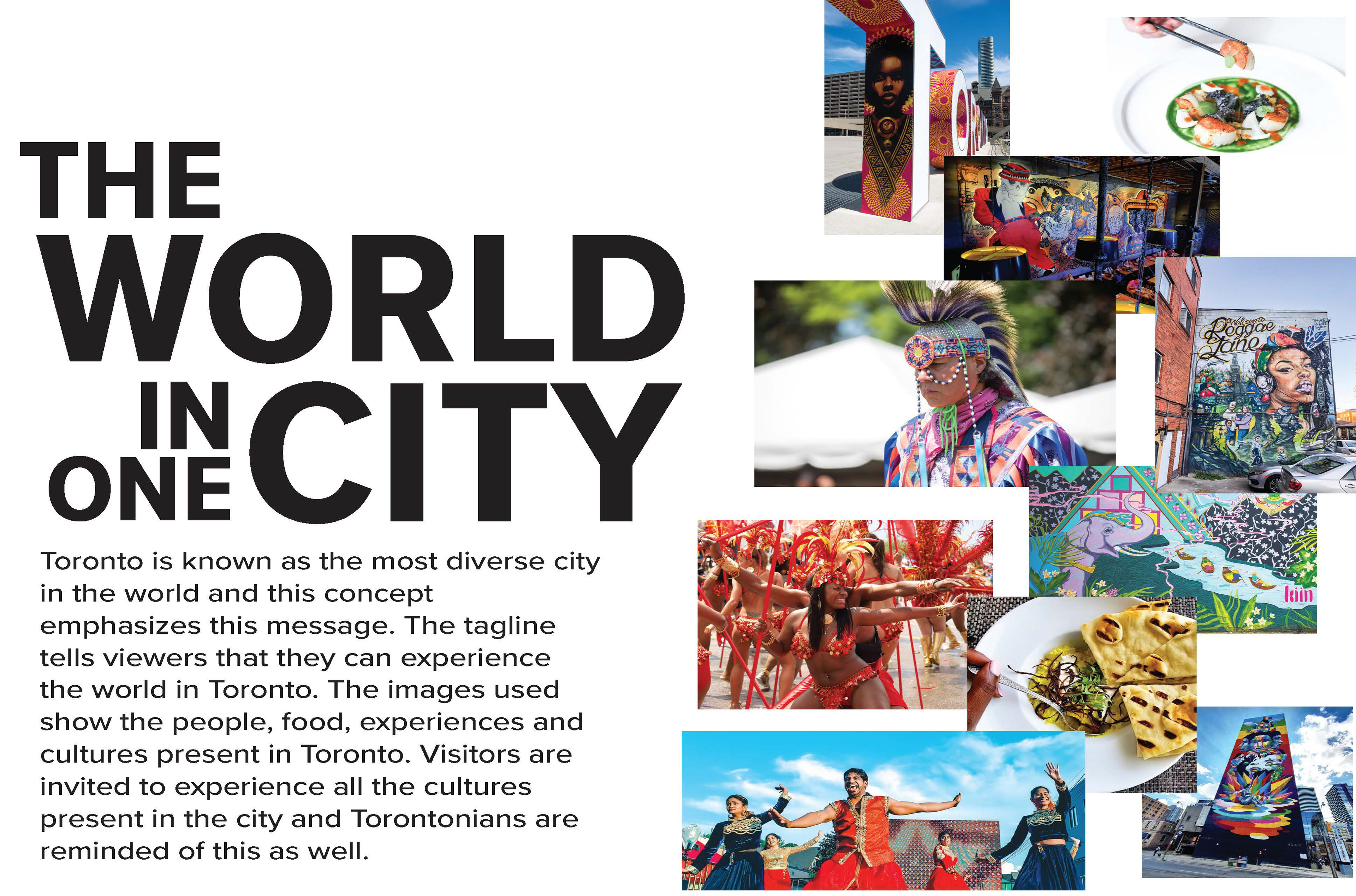
Idea #3 - The World In One City
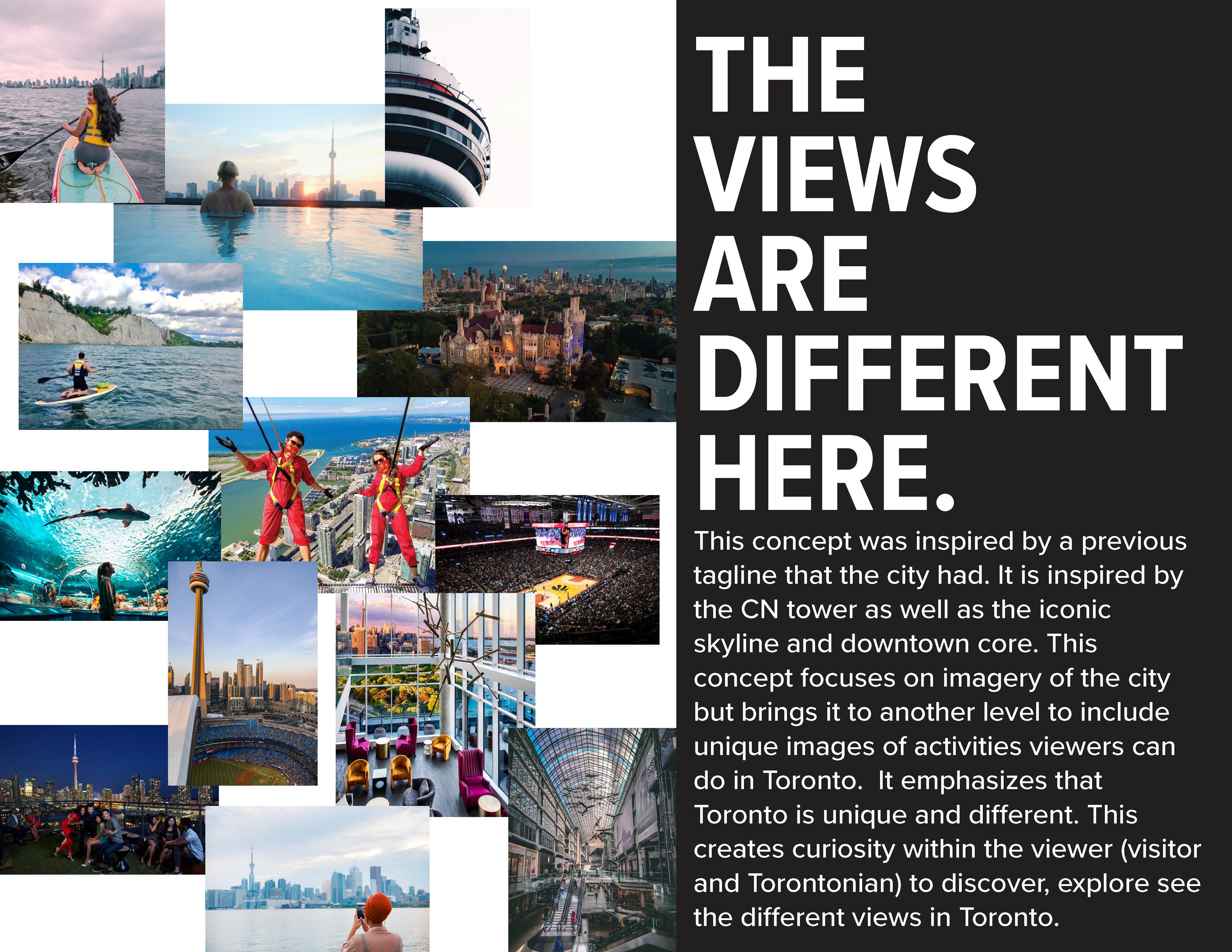
Idea #4 - The Views are Different Here
Concept Selection and Visualization
After the initial brainstorming and inspiration phase, I collaborated with stakeholders to explore potential concepts for the Toronto Pearson Airport doors. We chose two compelling themes: "Make Your Mark" and "The World in One City," both of which embodied the essence of Toronto.
"Make Your Mark" illustrated the idea that Toronto is a place where people mix and influence the city's evolving identity, inviting everyone to contribute to its future. "The World in One City" showcased Toronto's renowned diversity, highlighting the neighbourhoods, experiences, and cuisines that offer a global exploration within the city.
I developed detailed layouts for each theme, allowing stakeholders to visualize the concepts on the doors. This step involved refining visual elements to ensure alignment with stakeholder expectations and project goals, preparing them for a second review.

Chosen Concept #1 - Make Your Mark
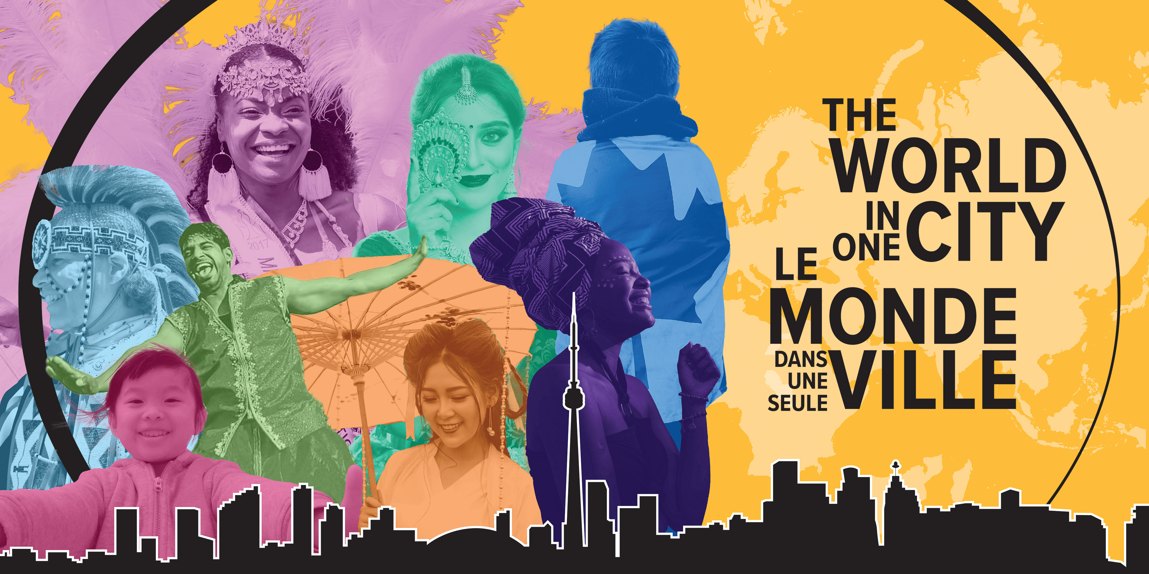
Chosen Concept #2 - The World in One City
Concept Refinement
After a productive second review with stakeholders, we decided to refine the two selected themes by aligning them with our existing successful campaigns: "Cultures Evolve Here" and "You Gotta See What We See." This strategic decision allowed us to leverage elements from these market-tested campaigns and enhance the final concepts.
We differentiated the themes further by having "Cultures Evolve Here" focus on landmarks and "You Gotta See What We See" emphasize people and experiences. The "Make Your Mark" concept naturally aligned with "Cultures Evolve Here," incorporating the same layering elements and adding a large CN Tower for dramatic impact. "The World in One City" matched the "You Gotta See What We See" campaign, strengthening the concept with a magnifying glass motif to invite closer exploration of Toronto’s unique experiences.
These refinements ensured that the designs resonated more with our audience while maintaining a strong connection to Toronto's vibrant identity, setting the stage for final approval before submission to Pearson Airport.
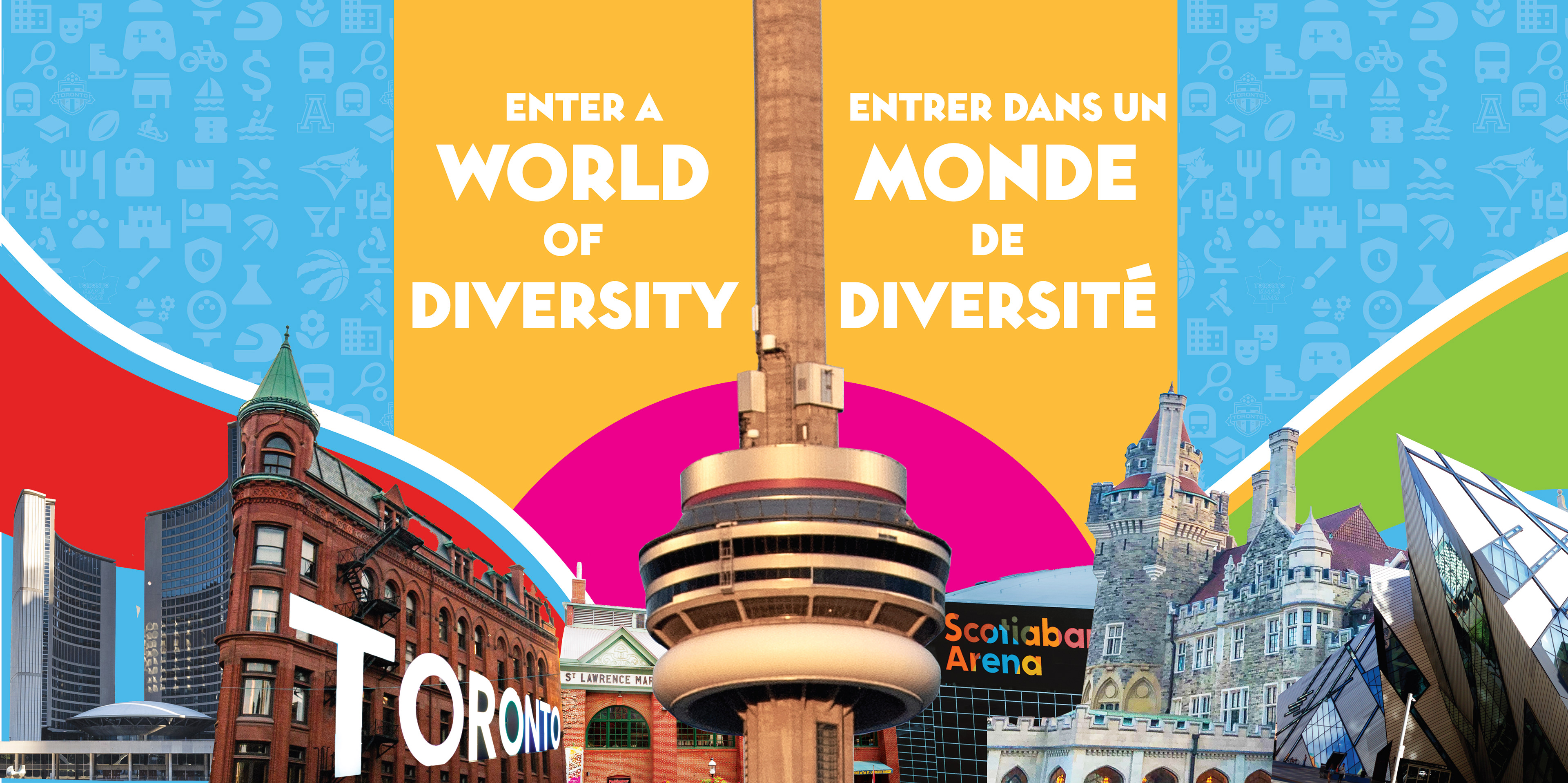
Concept Revision #1 - Cultures Evolve Here
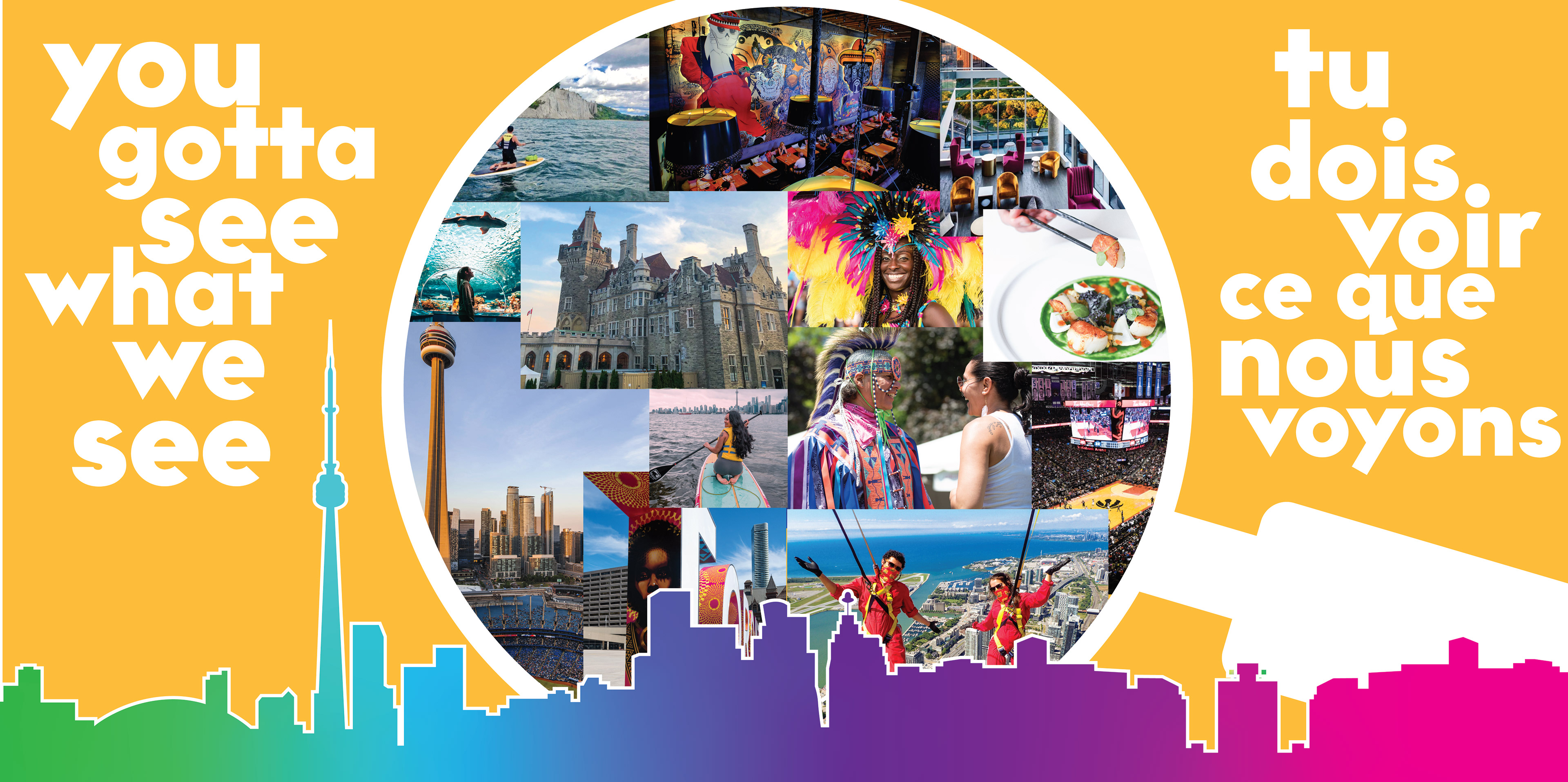
Concept Revision #2 - You Gotta See What We See
Final Concept Execution
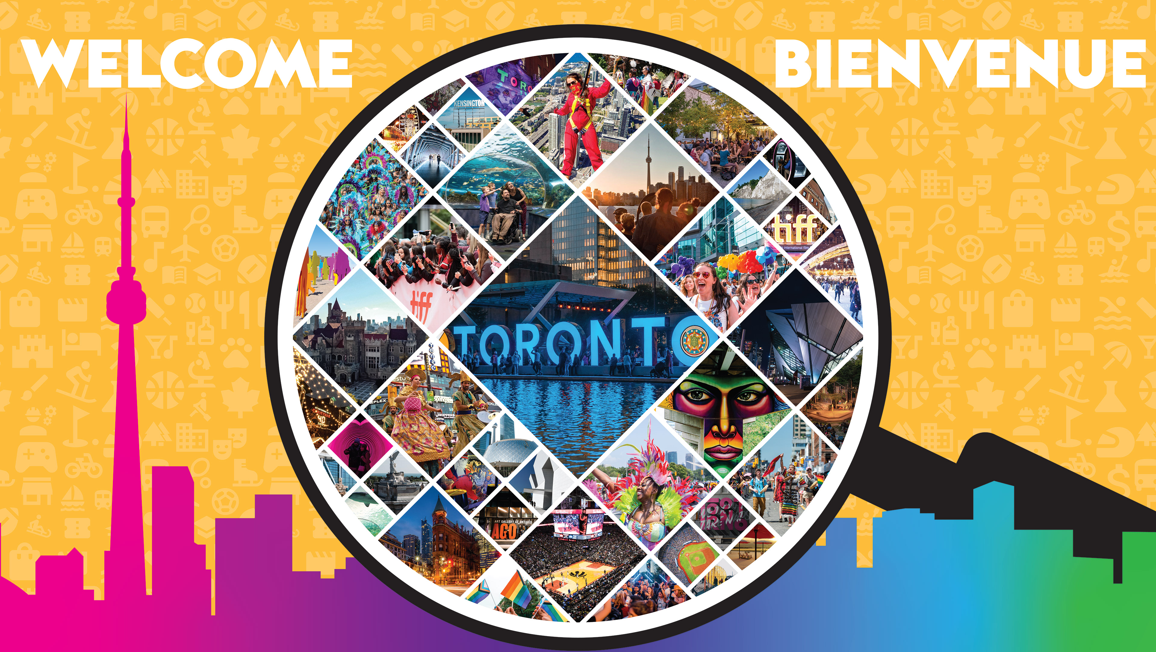
In the final stage, we chose to move forward with the "You Gotta See What We See" concept. I refined the design to intricately weave together Toronto's identity, incorporating landmarks, people, events, art, culture, and cuisine. The focal point of the design is a strategically placed magnifying glass, which ingeniously aligns with the movement of the exit doors, inviting both visitors and returning residents to explore Toronto’s vibrant offerings.
The magnifying glass serves as more than an aesthetic element—it symbolically immerses individuals in the city as they pass through it. To anchor the design, the city skyline graces the bottom, providing a visual foundation. The background, adorned with carefully chosen icons, adds texture and reinforces the activities awaiting exploration in Toronto.
As part of the refinement process, the text was simplified for clarity, and we created multiple color variations to differentiate the doors. Additionally, Pearson Airport requested artwork for the wall between the doors. We responded by creating a complementary design featuring "Welcome" in various languages, using colors that harmonize with the door artwork.
Ultimately, the artwork serves as a visual roadmap, guiding individuals to uncover the richness and vibrancy that define Toronto, inviting them to actively engage with the city's captivating experiences.

Concept Iteration
